What a CTA (call to action) is and how to use it in marketing
By Tiago CostaUpdated on July 2, 2026
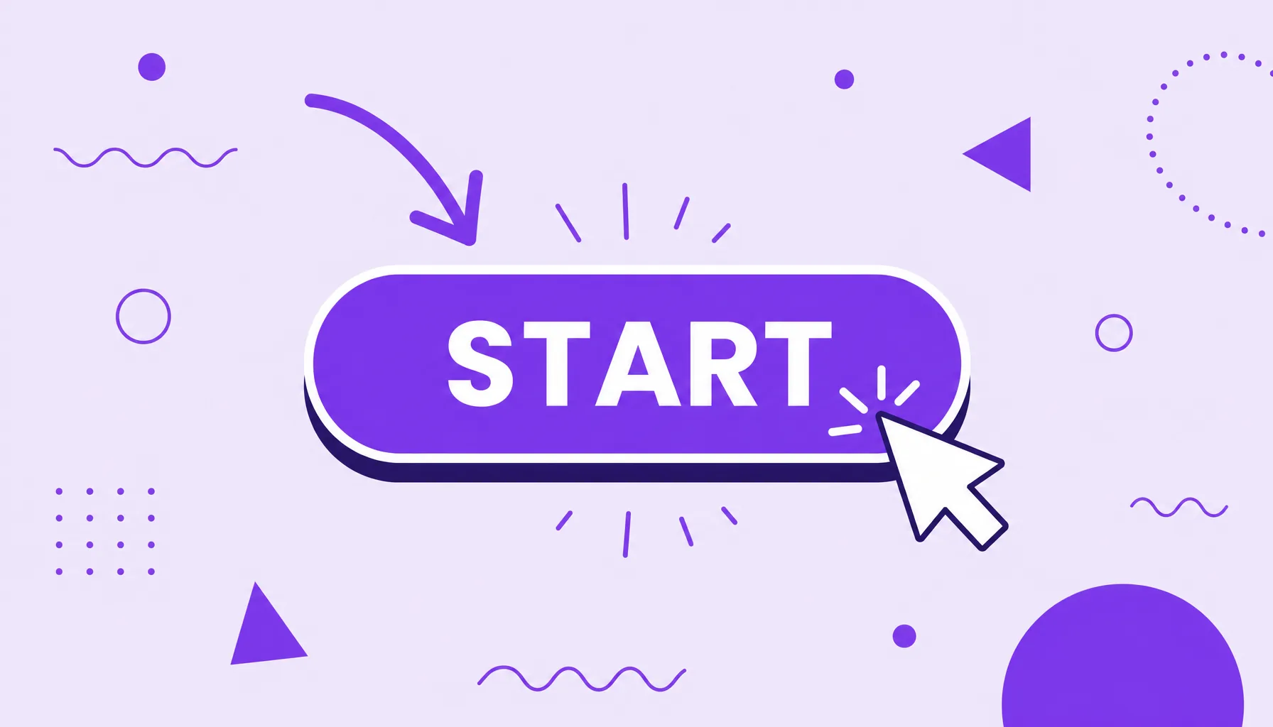
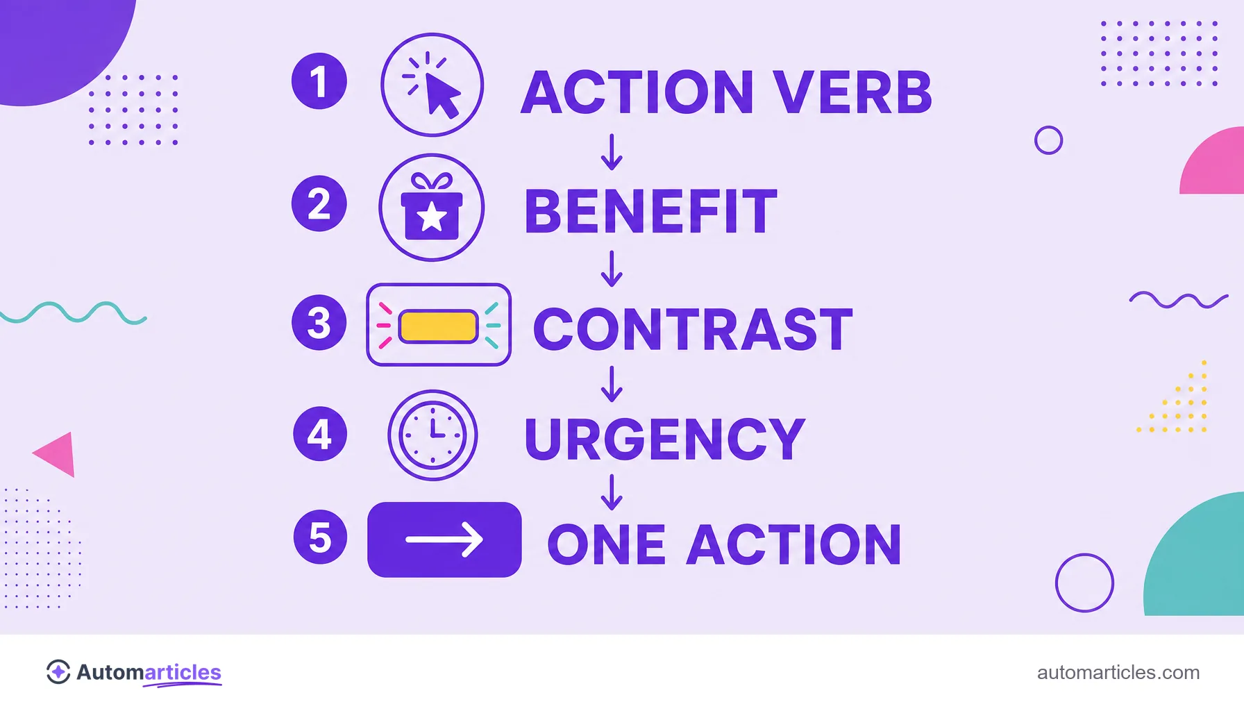
A CTA (call to action) is the invitation that leads the user to the next step, usually a button or link. A good CTA tends to have:
- a clear action verb (buy, download, subscribe);
- an explicit benefit for whoever clicks;
- visual emphasis, with a contrasting color;
- a single action at a time, without competing with others.
What a CTA (call to action) is
CTA stands for call to action. It is the element that tells the user, in a direct way, what to do next: subscribe to the newsletter, request a quote, add to cart. It can be a button, a link with anchor text, a line of copy or even a banner.
The job of a CTA is to remove doubt. An interested visitor without a visible instruction tends to hesitate and leave. The CTA erases that friction by pointing the way and reducing the decision effort to a single click.
That is why the CTA shows up in almost every marketing piece: at the end of an article, at the top of a landing page, inside an email or in an ad. Wherever there is a conversion goal, there is (or should be) a CTA.
What a CTA is for and why it is decisive
The CTA exists to turn attention into action. It connects the content that attracted the person to the outcome the business wants, whether that is generating a lead, a sale or a sign up.
Without a clear CTA, even great content becomes a dead end: the reader enjoys it but does not know what to do with it. With a well placed CTA, the same content starts feeding the funnel, guiding the visitor to the next stage of the buying journey.
The CTA is also what gives meaning to conversion rate optimization (CRO) metrics. Testing words, colors and button position only matters because each tweak to the CTA directly changes how many people move forward.
Types of CTA and where they appear
CTAs take different formats depending on the channel and the goal. The most common ones are:
| Type of CTA | Example of use |
|---|---|
| Button | "Get started" at the top of a landing page. |
| Text link | A prompt inside an article, with descriptive anchor text. |
| Banner or pop-up | An invitation to download a lead magnet. |
| Email CTA | "Confirm my spot" at the end of a message. |
Beyond format, the CTA varies in intensity. A primary CTA asks for the main action (buy, schedule), while a secondary CTA offers a lighter step (learn more, see examples) for those who are not ready yet.
What makes a good CTA convert
An effective CTA is not just a pretty button. It combines clarity, context and a reason to click now. The ingredients that matter most:
- An action verb in the command: start with a direct verb (download, grab, try).
- An explicit benefit: make clear what the person gains (get the free guide, not just submit).
- Visual contrast: the button needs to stand out on the page.
- Relevance to the audience: a CTA aligned with the persona and their moment converts far more.
- A sense of timing: when it is genuine, a trigger of urgency or scarcity increases clicks.
Personalization carries huge weight. According to data from HubSpot, which analyzed more than 330,000 CTAs, personalized CTAs convert around 202% better than generic ones. In other words, speaking to the right person at the right time is worth more than any aesthetic detail.
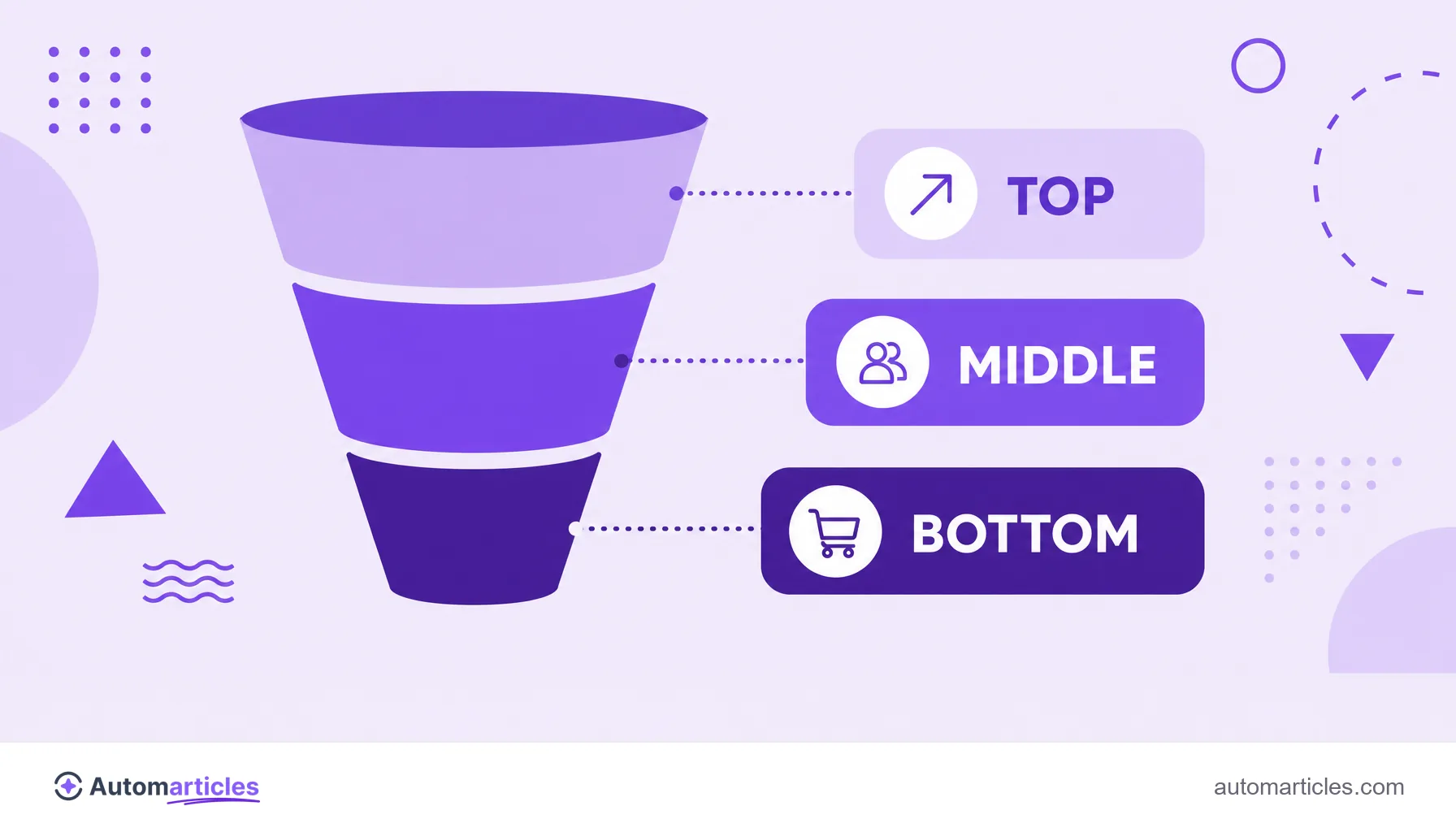
CTA by funnel stage
The best CTA depends on where the visitor is. Asking for a purchase from someone who just arrived tends to scare them off; offering only an article to someone ready to buy wastes the intent. A guide by stage:
- Top of funnel: at the top of the funnel, use light CTAs, such as read the full guide or subscribe to the newsletter.
- Middle of funnel: invite people to go deeper, with download the resource or get an assessment, feeding lead nurturing.
- Bottom of funnel: at the bottom of the funnel, be direct: talk to sales, start the free trial, buy now.
Matching the CTA to the stage avoids burning opportunities and makes each content piece push the visitor one step forward, with no rush and no forced shortcuts.
CTA in healthcare, transit and other meanings of the acronym
Because CTA is a short acronym, it names very different things outside marketing. It is worth clarifying the main ones to avoid confusion:
- CTA in healthcare: in medical imaging, CTA often means computed tomography angiography, an exam of the blood vessels. Nothing to do with a marketing button.
- CTA in transit: in the United States, the CTA is also the Chicago Transit Authority, the public transit agency that serves the city.
- CTA in business and education: it can appear in the names of companies, courses and systems, unrelated to the call to action.
- CTA as call to action: the sense used here, in marketing and SEO, is always the prompt that drives the user to the next action.
In this glossary, whenever we talk about a CTA we mean the call to action, the invitation that leads the visitor to convert.